This report was created as a term project for ME120: History and Philosophy of Design taught by Dr. Barry Katz at Stanford University. It examines Western consumer behavior through the lens of baby products by diving deep into the history of strollers and the social pressures surrounding them.
UPDATE: We sold the Bee on Craigslist and eventually bought (and later sold) the City Mini, which has the simplest collapsing mechanism on the market and is well built with a ton of features, but at 1/3 the price of the Bee. Today we use a $30 generic umbrella stroller that collapses into nothing. The Aprica Cadence, though nice, was too big and the Presto restraint buckle was clumsy.
In the end, choose a stroller based on how easy it is to perform simple, daily tasks. Fancy and expensive does not necessarily mean more intelligently designed or functional.
Laser Cut Acrylic
This is a color mixing toy featuring two layers of laser cut acrylic arcs that form concentric rings, all constrained within a clear acrylic plate. This toy was designed as a fun, interactive way to teach children about color mixing and the effects of neighboring colors on one another. By swapping out arcs and/or rotating the top layer, a wild and varied color display ensues. My current progress on a stop motion animation piece using this toy is below.
11 x 17 Printed Poster
Spring 2010 promotion poster for the David H. Liu Memorial Lecture Series in Design at Stanford, for which I was also the coordinator. This endowed lecture explores the intersection of design, technology, art, architecture and science. This poster advertised our the first ever panel discussion, bringing together design leaders and moderated by renowned author, Barry Katz.
Past speakers have included Santiago Calatrava, Stefan Sagmeister, John Maeda, Ben Fry, Janine Benyus and Paola Antonelli.
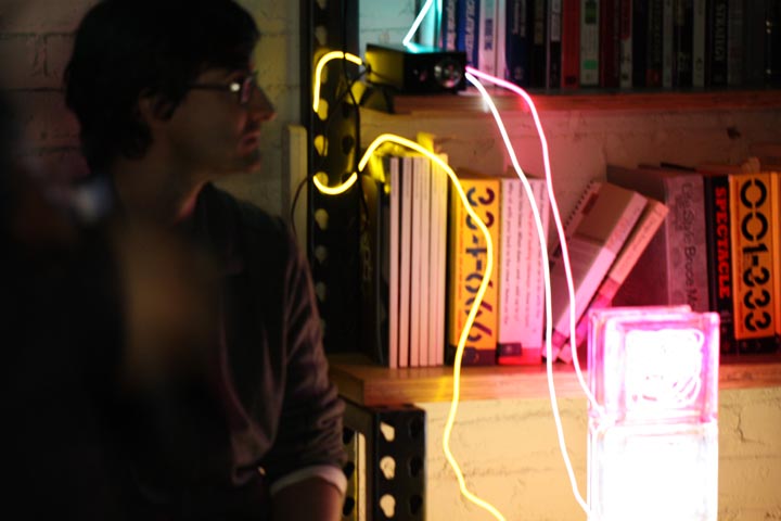
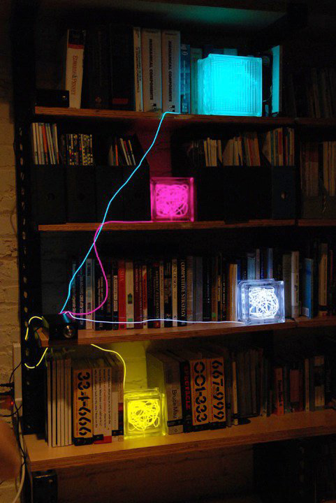
The updated version of these light sculptures took off on fab.com in May 2012. You can learn more and buy them at betablocs.com.
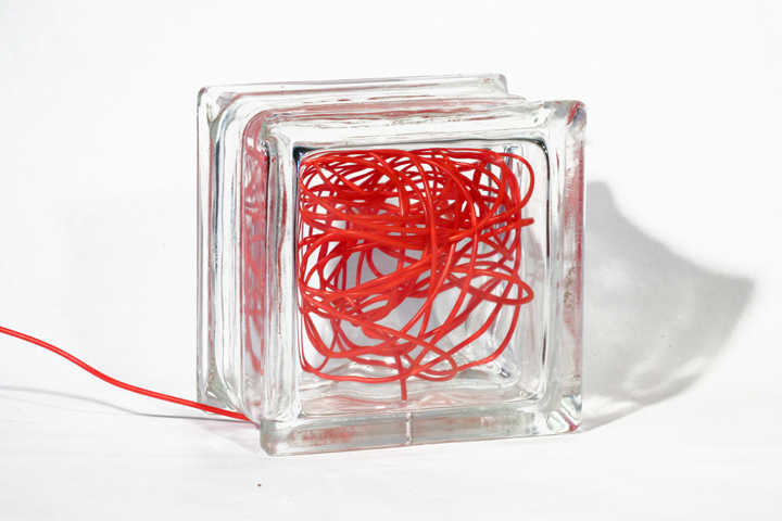
Reclaimed Architectural Glass Block + Electroluminescent Wire + Electronic Controls
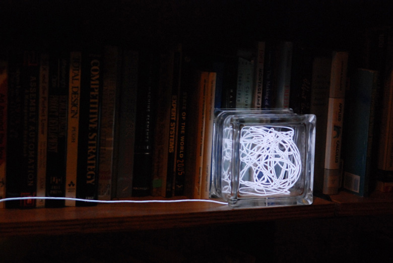
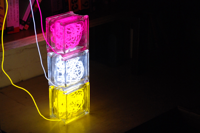
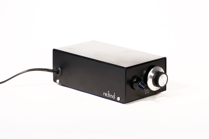
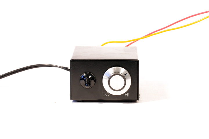
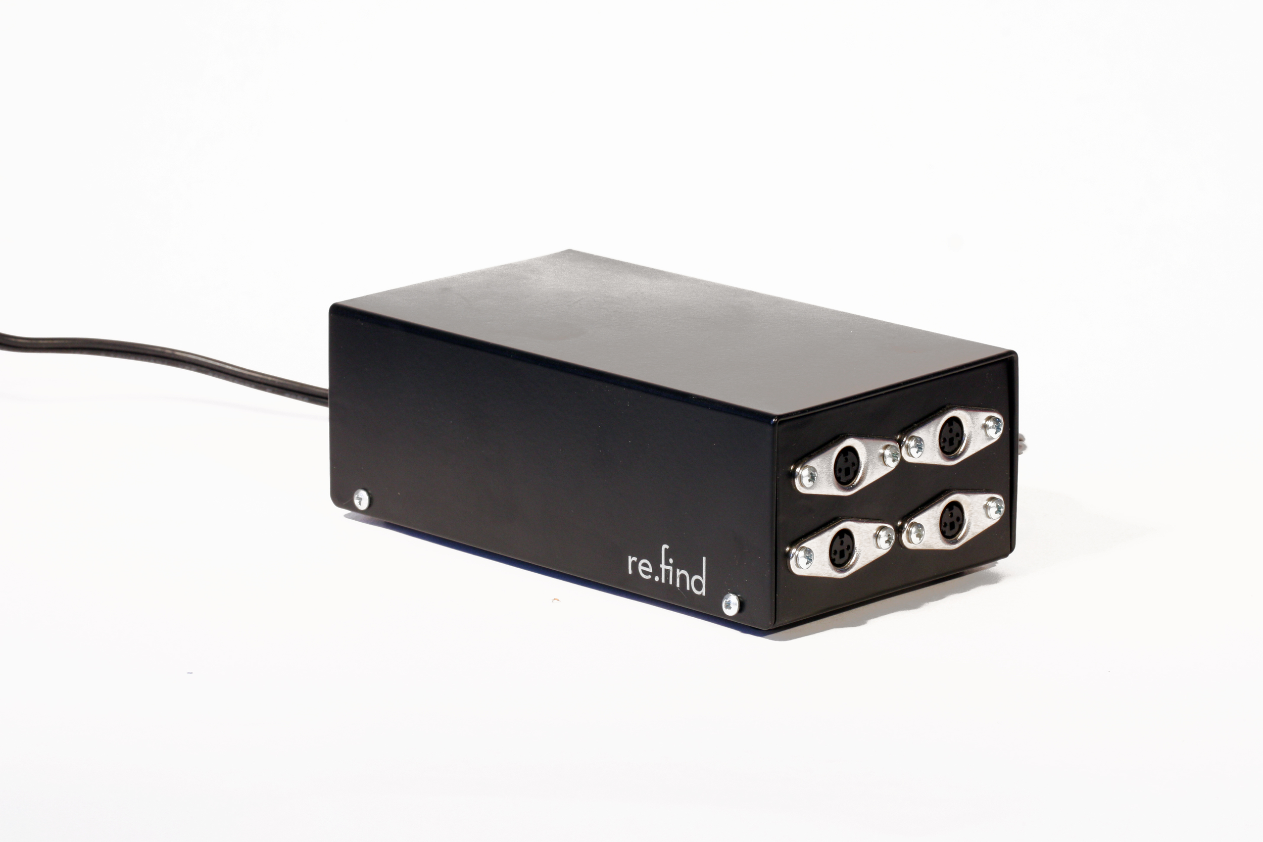
This is one of my favorite projects, created during Bill Burnett's Formgiving class for the Illuminating Object assignment. Modular Beta Blocs were created from reclaimed architectural glass block and electroluminescent wire that plug into a purpose-designed control box. They are dimmable and can be programmed to a respond in various ways to a wide range of external stimuli including ambient light, sound, touch, temperature, humidity, proximity, etc.
This animated gif shows how a new version responding to sound.
The video below shows the very first prototype responding initially to the sound of bubble wrap popping, then to the vibration caused by me shaking it vigorously.
From a design perspective, I chose to explore the physical principle of Brownian Motion, or the seemingly random movement of particles suspended in a liquid or gas. The 25' - 40' of EL wire are fed carefully into a painstakingly drilled hole in each block. The path of the EL wire is primarily a function of the block's internal volume and features, enabled by only minor aesthetic input during the assembly process.
SolidWorks rendering.
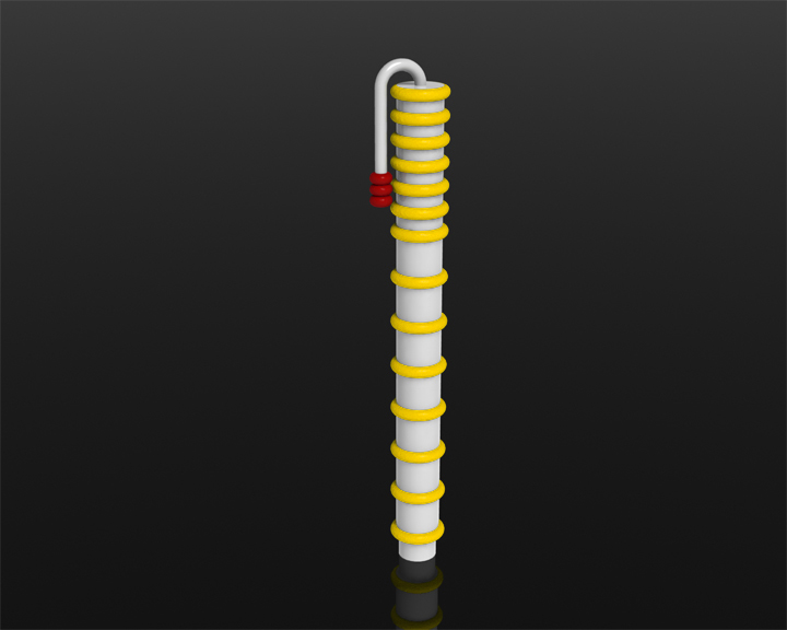
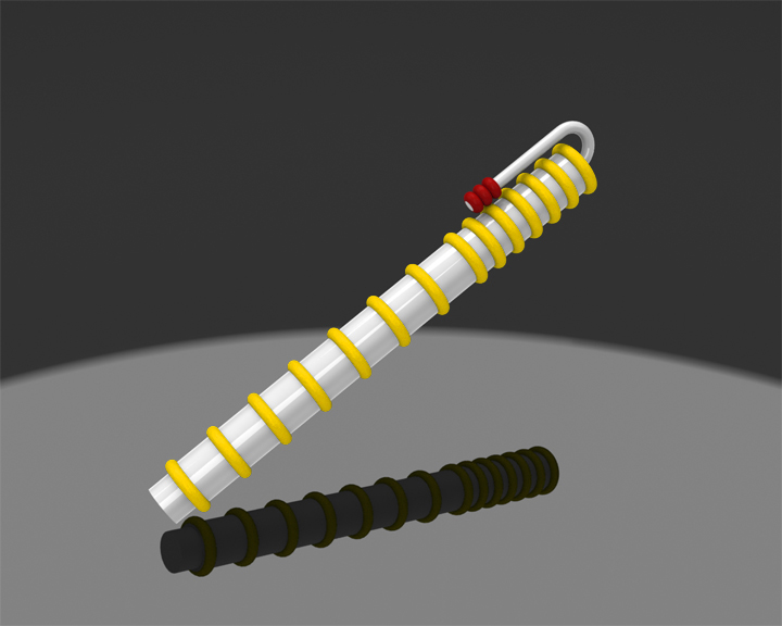
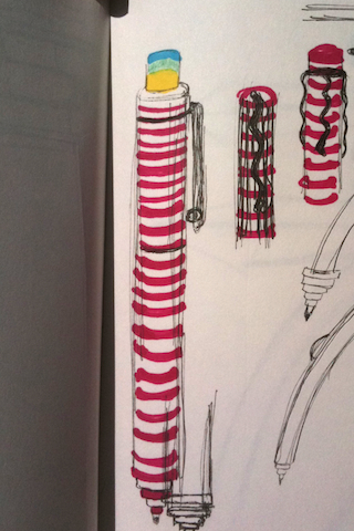
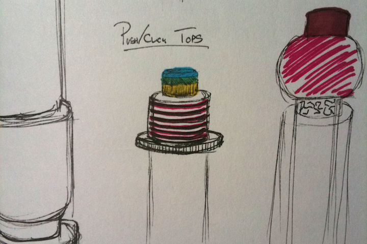
This pen concept was created in the style of one of my design heros, Ettore Sottsass for Bill Burnett’sFormgiving class. I was particularly inspired by some decidedly science fiction drawings found in 700 Drawings: Sottsass.
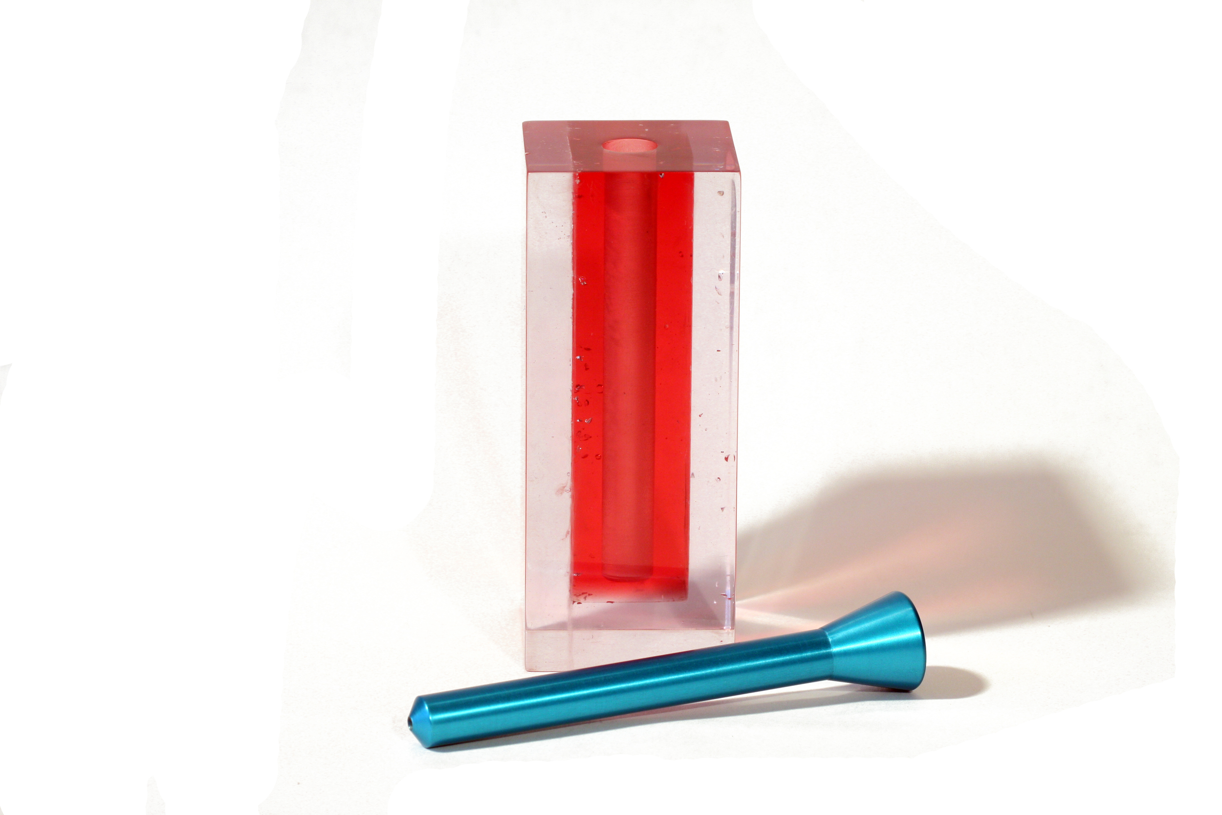
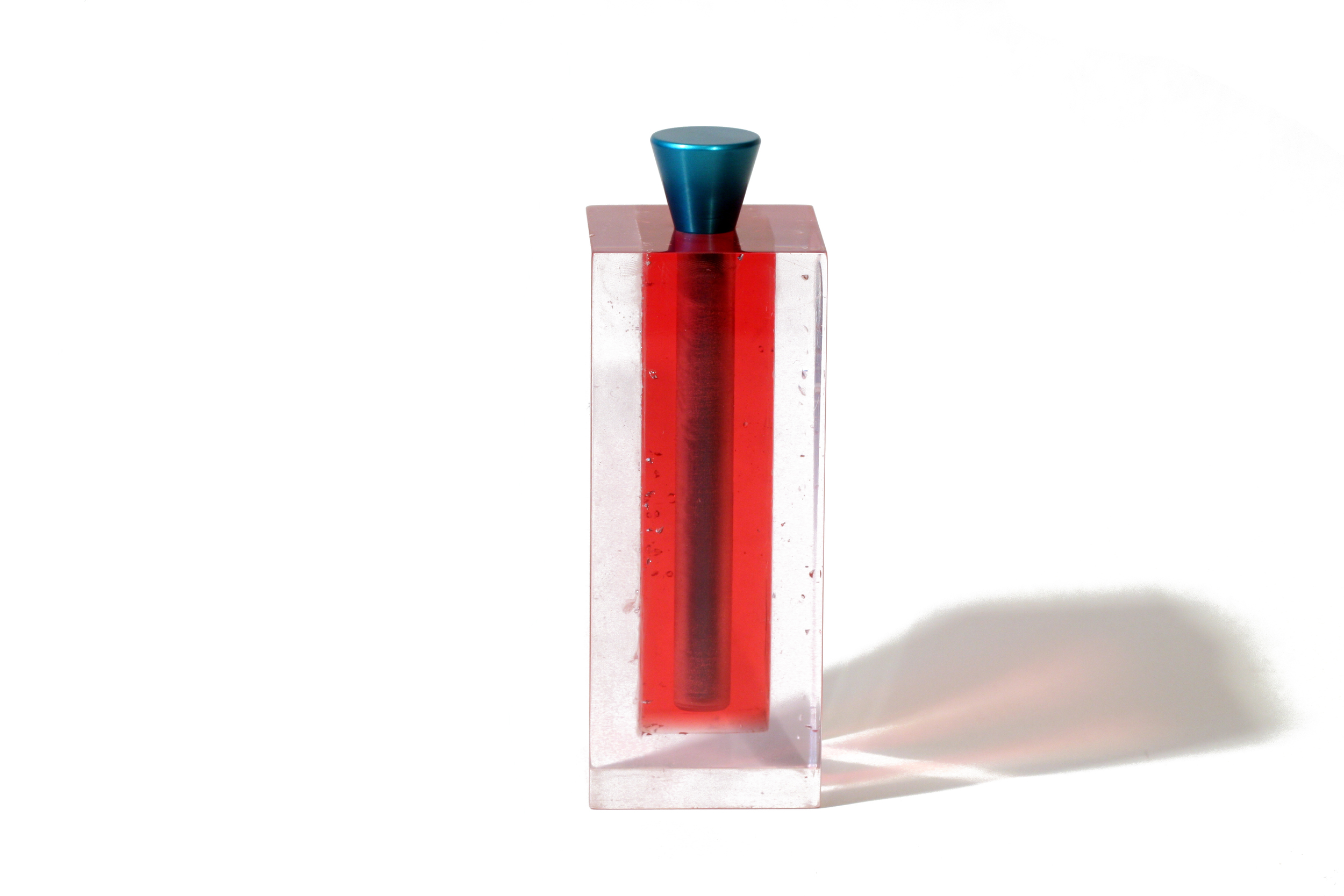
Cast acrylic block and aluminum.
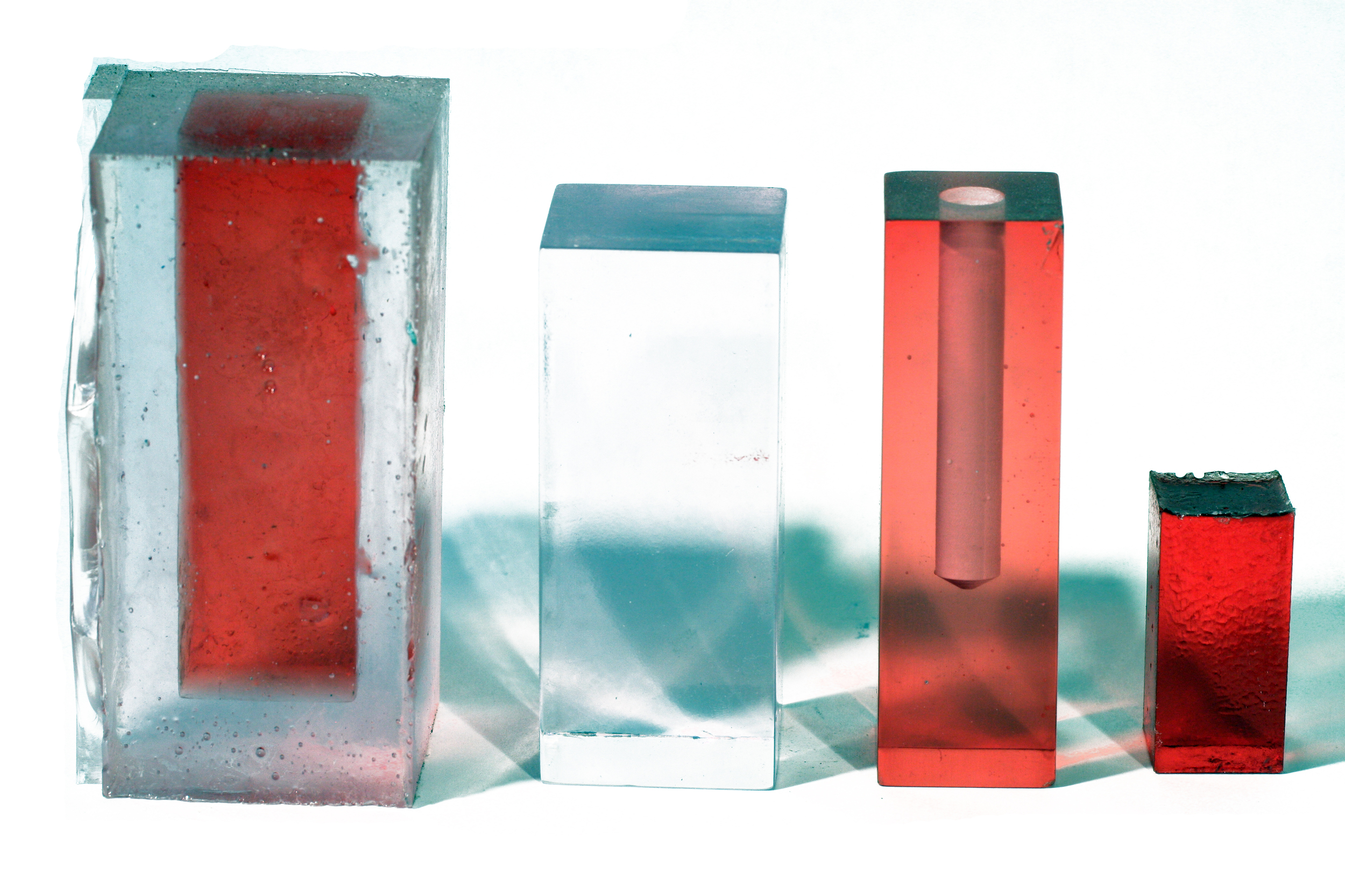
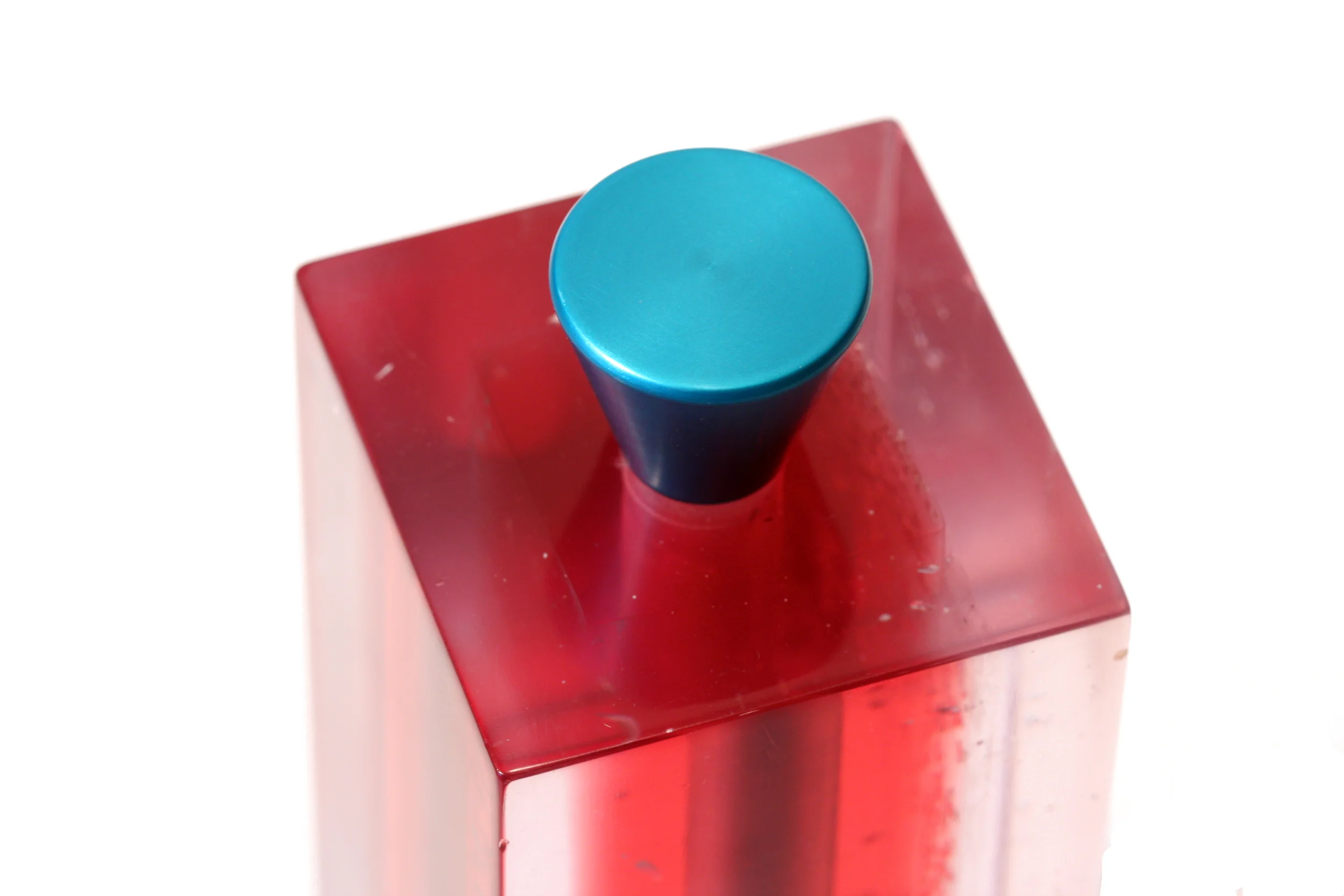
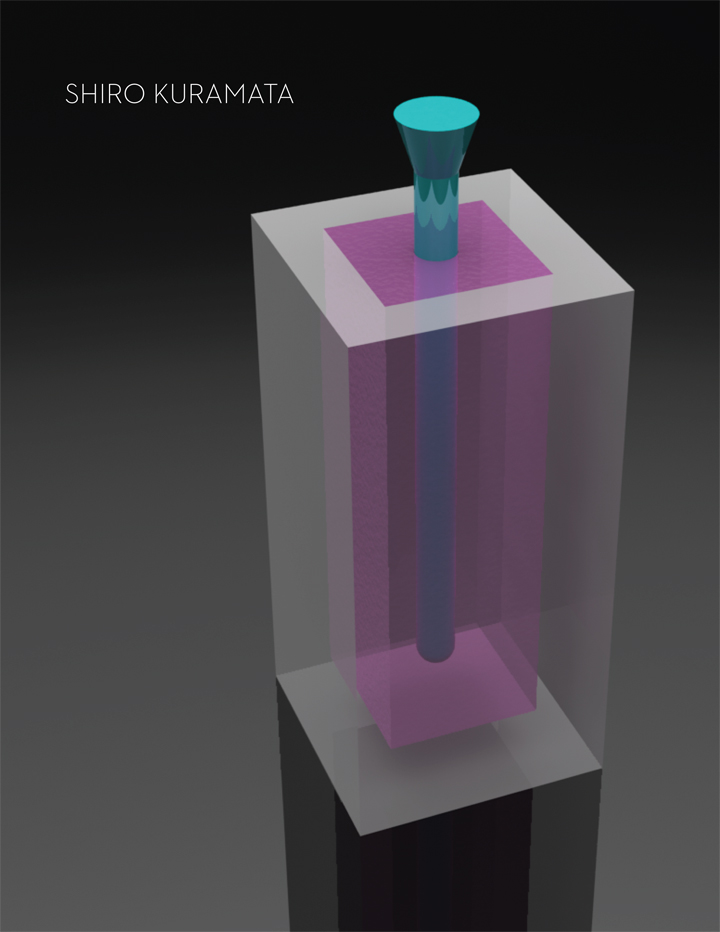
This pen prototype was created in the style of one of my design heros, Shiro Kuramata, for Bill Burnett’s Formgiving class. The three-part acrylic cast block was milled, polished and drilled. The pen was turned on a lathe and annodized. This was my first attempt at acrylic casting. My advice? Outsource this process. Even cured under vacuum it was difficult to get very good results.
Painted Delrin and aluminum.
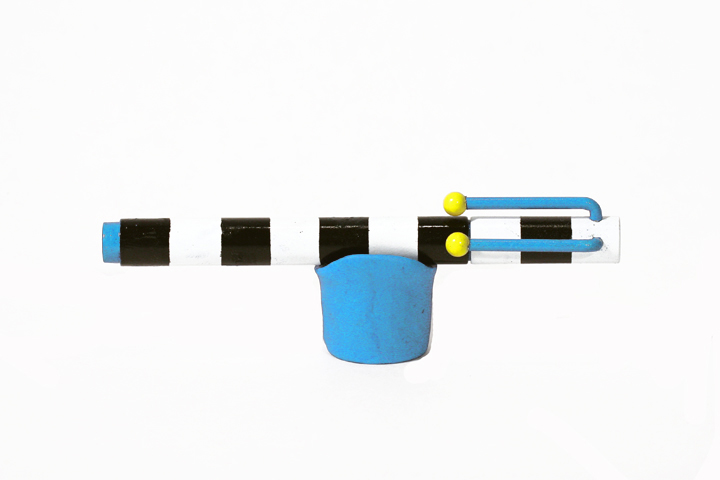
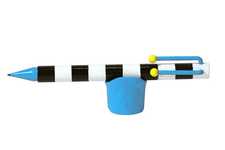
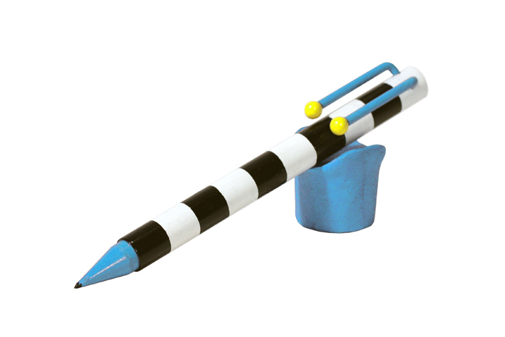
This pen prototype was created in the style of one of my design heros, Michele De Lucchi (c. 1983). It was crafted during Bill Burnett’s Formgiving class, turned on a lathe and painted by hand.
Below are my early SolidWorks renderings.
Pink foam + black foamcore
These studies were completed for Bill Burnett's Formgiving class in the Stanford Graduate Design Program. The composition on the left represents "ordered" whereas the one on the right is "random."
These hand-shaped pink foam models are housed in purpose-built foamcore dioramas. The larger spheres were roughly 3.5" in diameter. Below is a simple stop-motion animation of "ordered," which depicts spherical packing efficiency. Also below are my (very green) concept marker renderings.
Pink foam + black foamcore
These studies were completed for Bill Burnett’s Formgiving class in the Stanford Graduate Design Program. The composition on the left represents “open” whereas the one on the right is “closed.”
These hand-shaped pink foam models are pictured on a purpose-built foamcore stage. The cylinders are roughly 3.5″ in diameter by 9" tall.
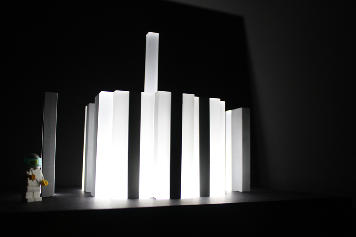
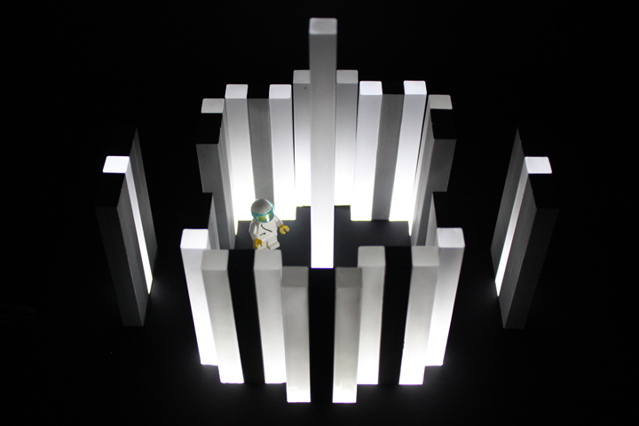
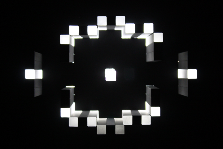
Sandblasted aluminum, acrylic, foamcore + LED
For this project, I envisioned a calm public space nestled along a fjord in Iceland. Although I originally planned to create a grotto-like ceiling and stepped walls for this piece, once I placed the main walls, I was taken by the simplicity of it. The floor plan, however unintentionally, resembles a Kalachakra mandala.
11 x 17 Printed Poster
A Polaroid was my first "real" camera and I loved it. I used it overwhelmingly to document my myriad Lego creations. Unfortunately, these photos have not yet "turned up."
Despite many corporate missteps over the years, Polaroid has enjoyed a cult following and seems to be rounding the corner. Charles + Ray Eames even made a great film about the seminal SX-70 (below). I wanted to create a corporate identity that I felt accurately reflected my admiration for the brand.
This identity concept is actually a riff on the geometric construction of a root spiral (Spiral of Theodorus). I segmented the design to create a greater sense of motion and used the composition to explore color mixing. I am especially fond of the way the orange and purple hues blend at their boundaries.
Created for Stanford University's Human Values and Design Innovation class (ME313), DigiPen is a conceptual interactive surface input device designed to promote effective collaboration among junior high and high school students.
The following presentation details the research and ideation underlying this concept.
Created during Stanford University's Human Values and Design Innovation class, Bodega is an iPhone app designed to help people organize and share recipes between friends as well as access media-rich educational and entertainment content on the Food Network. The objective of the project was to use technology to reconnect people with food and increase nutritional intelligence.
The following presentation details the research and ideation underlying this concept.
Pumpkin + Candle
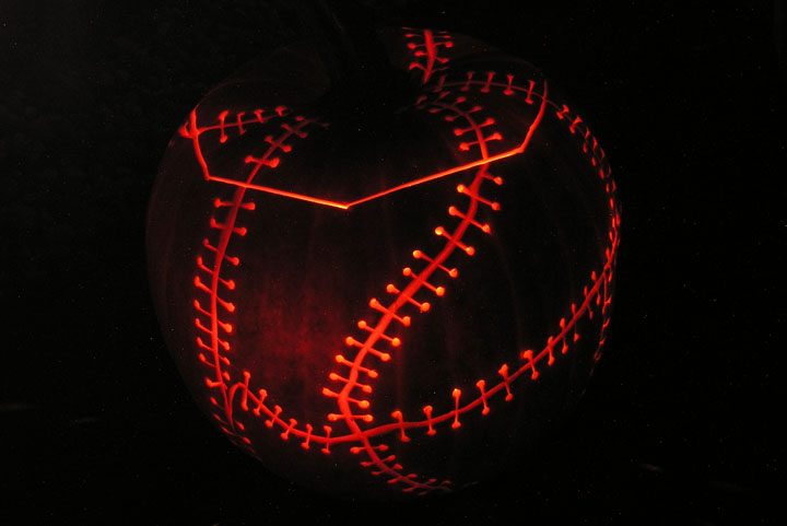
Halloween pumpkin carving is a long-standing tradition at the Stanford Design Program. First year graduate students carve one (or more) as part of their ART 60 class and everyone takes their creations to professor emeritus Matt Kahn's house for the annual party.
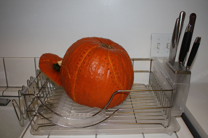
The unique look of this pumpkin was crafted through various techniques. The translucent areas were carved out to an airy thinness to illuminte the texture of the pumpkin's flesh. The scars and sutures were carefully cut through only the rind, while the suture holes were punctured clean through with a cordless drill.
His and Hers hand-cut felt appliqué t-shirts designed for The Design Loft "Icon" Halloween Party in 2009. Collaboration with Jennifer Marie Heinegg (aka Wifey).
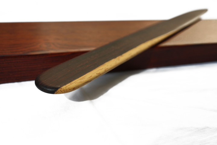
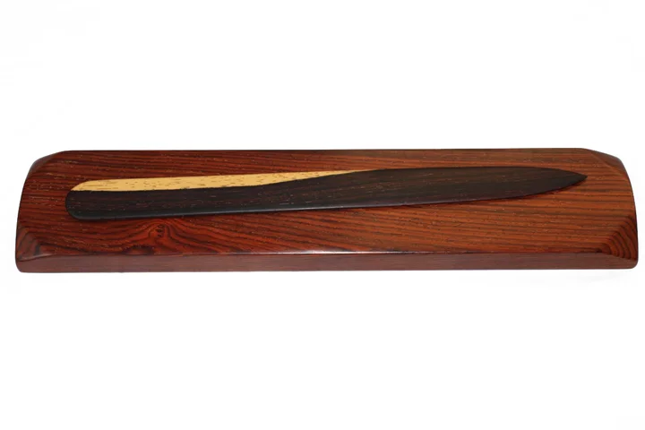
Cocobolo.
In the age of email, receiving a handwritten letter is particularly delightful. I crafted this cocobolo letter opener to heighten the anticipation and tactile aspects of that experience.
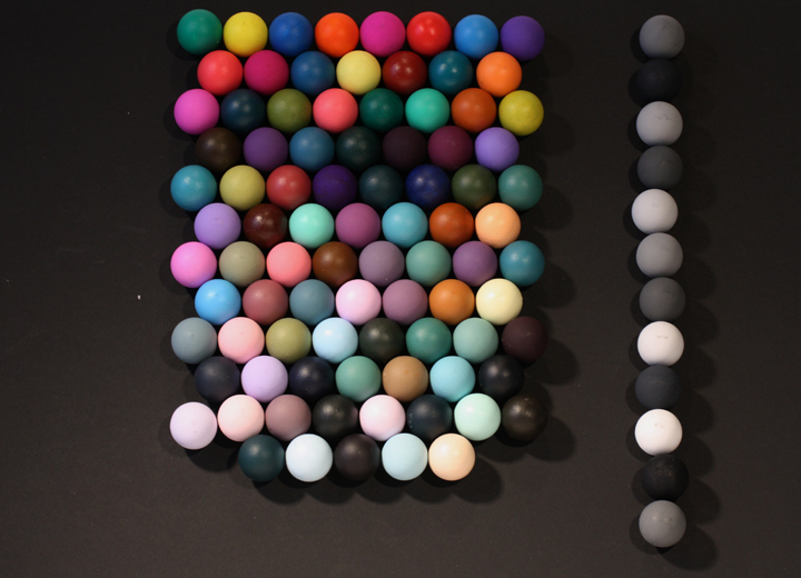
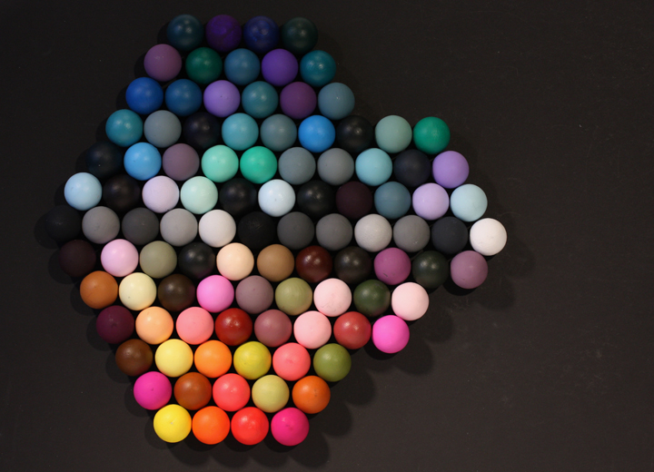
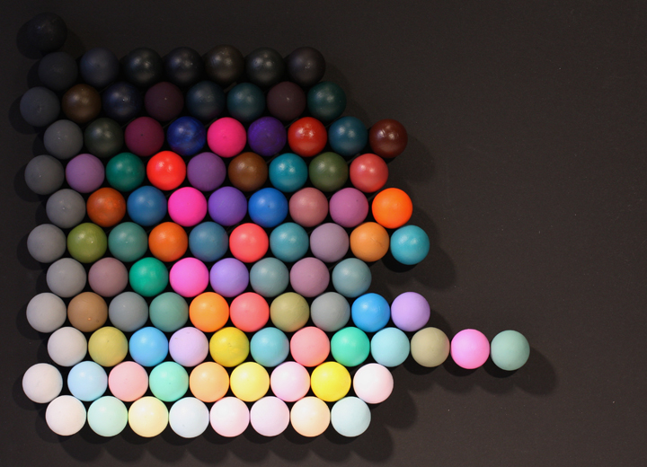
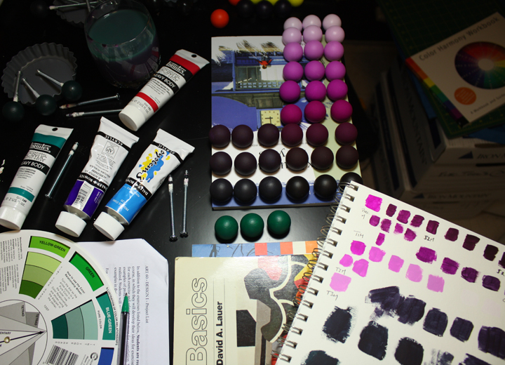
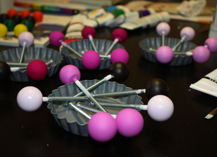
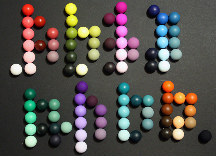
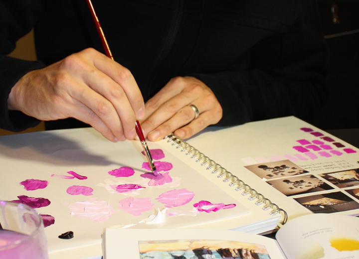
Stanford's ARTSTUDIO60 class is a contemporary take on The Basic Course at the Bauhaus as taught by Johannes Itten. It is a rite of passage in the Stanford Design Program. 300 Objects, is essentially a color theory exercise in which students paint 300 small objects and arrange them in three different patterns using 100 objects per pattern. The goal is to give students a more intuitive understanding of color and a language in which to communicate it.
This is a concept piece playing with the subjectivity of design fads/trends. Is it any stranger than a claw footed tub? I really need to make this.
Post-It® Notes
This 4' x 4' Valentine's Day mural was installed in Montreal and was comprised of over 300 Post-It® notes.
Paper
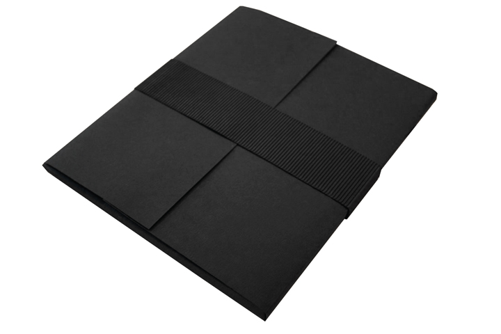
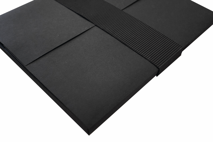
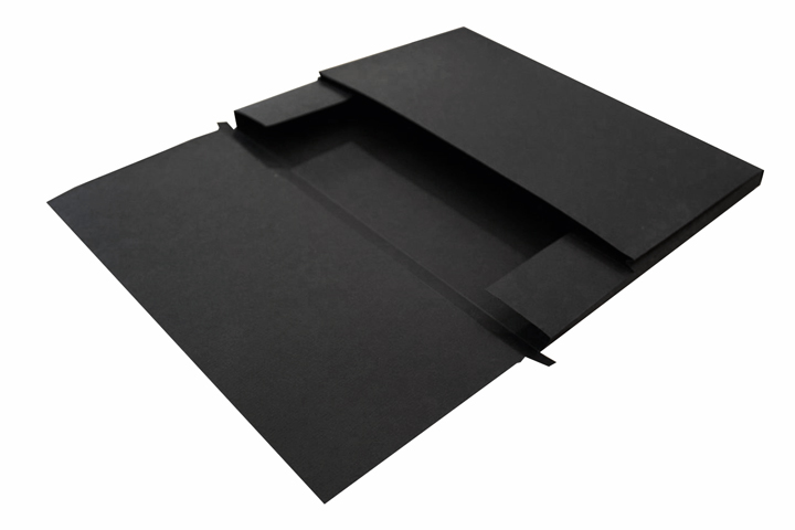
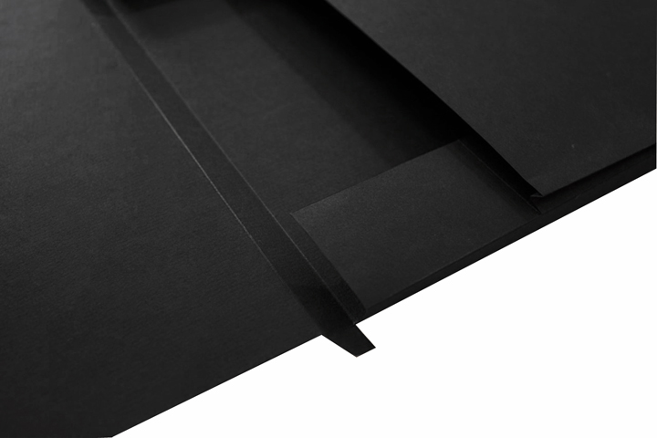
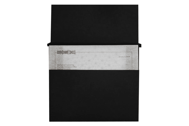
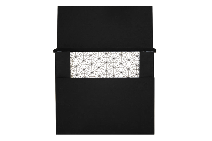
Hand folded paperboard case for my printed portfolio book and cover letter. Created to support of my application to the Stanford Graduate Program in Design.